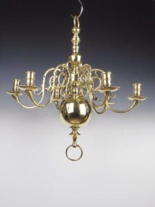
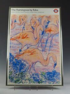

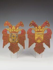
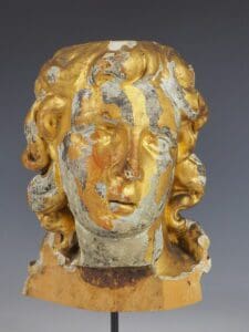

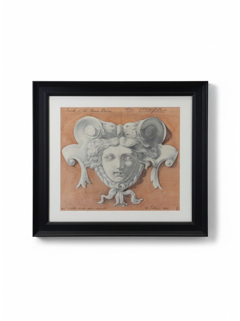
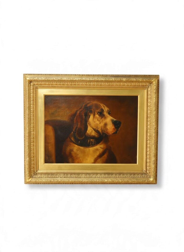
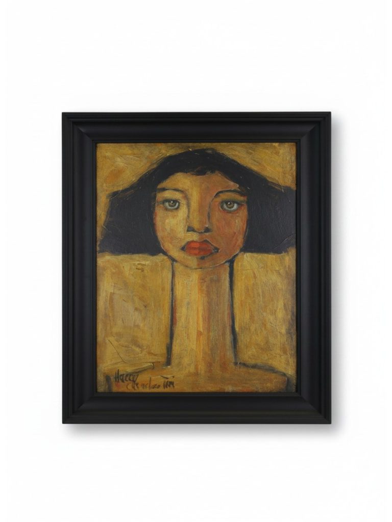
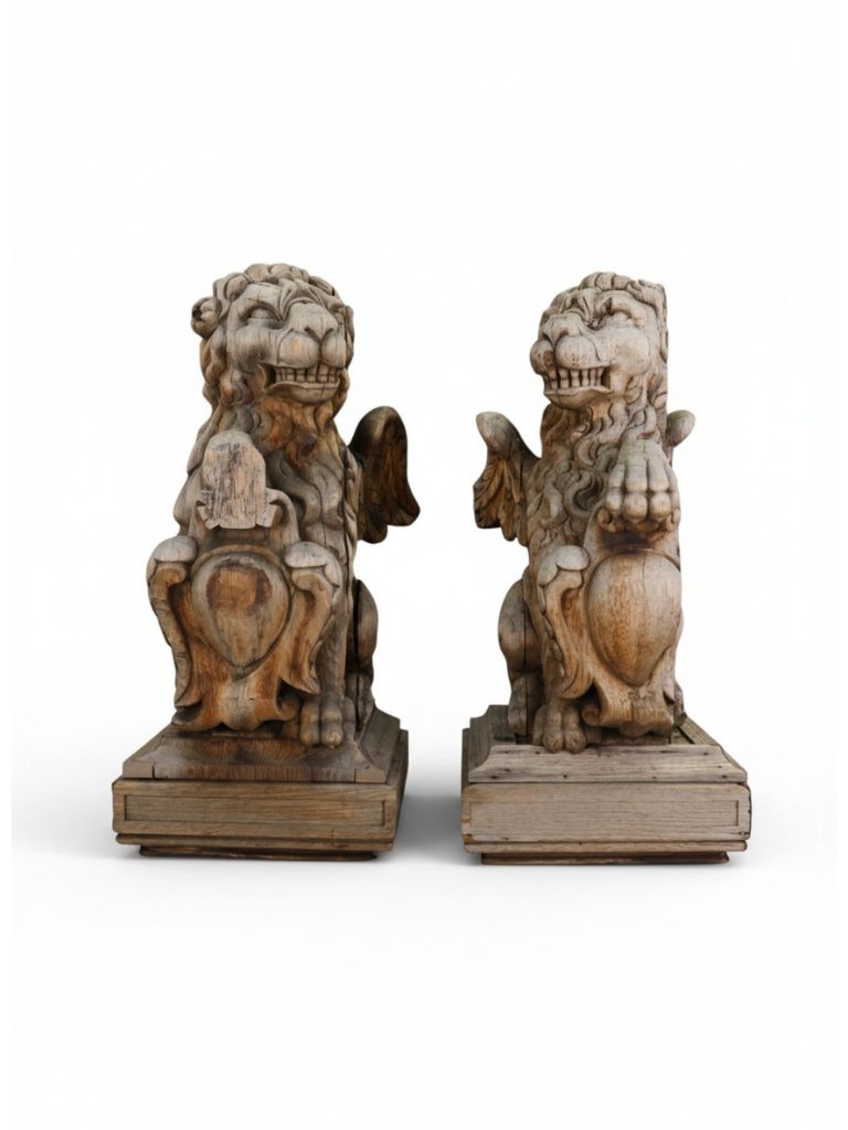
Bold colour schemes are interior schemes built around rich, saturated or dark colours used with confidence on walls, joinery and textiles, rather than the pale neutrals often associated with modern decoration. Deep greens, navy and Prussian blues, oxblood and burgundy reds, ochre, terracotta and charcoal are typical, and they are frequently chosen as a backdrop for antique furniture, gilt mirrors, brass lighting and pictures.
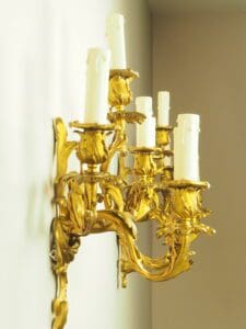
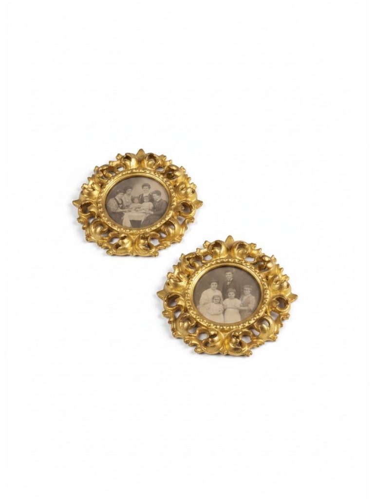
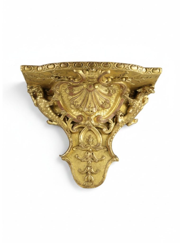
Strong colour has a long history in British interiors. Georgian rooms used costly pigments such as verditer blue, pea green and yellow ochre as a mark of status, and Victorian householders favoured crimson dining rooms, deep green libraries and richly patterned papers. Painted panelling, lacquered walls and dark hall colours return regularly to fashion, and the historic paint ranges now widely available draw heavily on these precedents. Dark grounds suit antiques particularly well: polished mahogany and walnut glow against them, gilding and brass catch the light, and oil paintings in gilt frames gain depth. Success depends on balance. Natural materials such as linen, wool, stone and timber soften the effect, while careful layering of table lamps, picture lights and candlelight prevents a deep colour from becoming oppressive and lets each piece read as a focal point within the room.